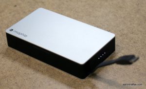
My friends at Verizon sent a couple devices for me to take along to the 67th International Auctioneers Conference and Show held last month in Grand Rapids. Knowing the demands a week-long convention would place on the batteries in my mobile devices, they sent the mophie powerstation plus 3x with Micro USB Connector.
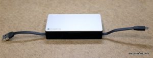
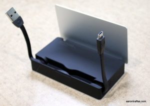
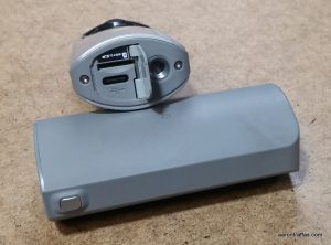
I’ve used external battery packs before – I currently have a stack of five on my desk. However, I’ve never seen any that has the build quality or premium design aesthetic as the powerstation. It’s completely self contained, sporting only an input cable with a USB type-A plug and an output cable with a Micro-USB plug. These two cables fold up into a slot underneath the hinged cover when not in use. Pressing the button on the end of the unit triggers the four lights to display current charge status.
Battery capacity is measured in milliampere hours, or mAh. The powerstation plus 3x has a capacity of 5000 mAh. For context, most phones have batteries in the 3000-3500 mAh range. The Zerolemon battery on my LG G3 that I’m currently using has a capacity of 9000 mAh, so while the powerstation couldn’t charge it completely, it would give it a big boost. Most phones could take more than a complete charge from the powerstation.
While it doesn’t support Quick Charge, the powerstation advertises a 2.4 amp output, which is the most I’ve ever seen on a portable power pack and also more than the majority of wall and car chargers I’ve seen.
The mophie powerstation 3x with Micro USB Connector is elegant and convenient, though the minimalist design comes at a cost. It doesn’t require additional cables in order to charge the device or charge a phone, but it unfortunately doesn’t support charging anything other than a single device with a Micro-USB connector.
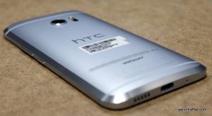
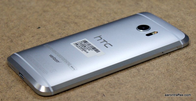
After the conference was over, our return flight to Kansas was cancelled. We ended up renting a car and driving all night back from Grand Rapids. While the powerstation worked great to charge my LG G3, I couldn’t use it to charge the HTC 10, which has a USB Type-C connector, nor my friends’ iPhones. I was lucky I had another battery pack that had traditional USB ports with me that I could toss in the back seat for them. mophie does make a version of the powerstation that has a Lightning connector instead of the Micro USB cable, but I would prefer if they’d simply add an additional port on the unit that could be used to power a second device using any cable.
If you only have devices that use Micro USB, it’s going to be tough to find a portable battery pack that’s as well built or simpler to use than the mophie powerstation plus 3x.
It’s no secret that I’m a huge fan of LG phones. I still maintain that the LG G3 combined with the Zerolemon battery is the perfect combination for farming. I’m still using it as my daily driver this summer, but only because Zerolemon doesn’t make a belt clip that works with the G4 and V10 battery upgrades.
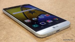
I was disappointed to hear of the changes LG made to the latest offering in its G line of devices, but I still jumped at the chance when Verizon offered to let me try out the new G5 over wheat harvest. I found a phone that takes some steps back from the features of the LG G4, but it makes one monumental leap forward – so much so that I immediately ordered one for my wife Diane.
There are four areas where I see the G5 as not as good as the G4. The G4, like the G3 before it, has volume buttons next to the power button on the center of the back of the device. It’s a design unique to LG that I’ve learned to love; the G5 keeps the power button on the back but disappointingly returns the volume rocker to the left side of the phone.
Secondly, the G5 has a slightly smaller screen. The G4 and G3 had 5.5″ screens while the G5 has a 5.3″ screen. It might not seem like much of a downgrade, but for those of us who like big screens, it’s enough to notice and to miss.
The G4, like the G3 before it and the V10 after it, featured a removable back and upgradable battery. The option to replace the paltry factory battery with an extended battery is an upgrade I’ve cherished since my Galaxy Nexus. I upgraded to Zerolemon batteries on my Galaxy Note 3 and then my LG G3. These 10,000 and 9,000 mAh batteries, respectively, would let me skip a night of charging during normal use or run from 5:30 a.m. to midnight during heavy harvest use and not have to worry about finding a mid-day charger. The G5 has a solid back. While you can replace the battery, it’s done by sliding the battery out of the bottom, which means it’s unlikely anyone will make a replacement battery that’s much bigger than the 2800 mAh factory battery.
The last major area where the G5 let me down is the most important – it doesn’t support wireless charging. It’s 2016, and I don’t want to plug my phone in to charge it like an animal. The G3 and G4 each had pins under the removable back that would support the upgrade for wireless charging. While I might be able to live without volume buttons on the back or a battery that lasts past 2 p.m., I don’t know that I can go back to using a cord for charging.
With these three steps back from the G4, what feature was upgraded enough to cause me to reflexively throw money at the internet to get a G5 for Diane? The cameras. Oh, my goodness – the cameras.
The G3 and G4 had amazing cameras. The optical image stabilization and laser autofocus on my G3 kept it competing neck and neck against cameras on phones that were released a full year later. I liked the camera on the G3, released in May 2014, better than the 21 MP camera on the Droid Turbo 2 which was released in October 2015. The G4 was the first camera that gave Samsung’s flagship at the time real competition. The V10 introduced a unique second front-facing camera, one with a wide-angle lens that made taking selfies with friends or, in my case, children much easier and more fruitful.
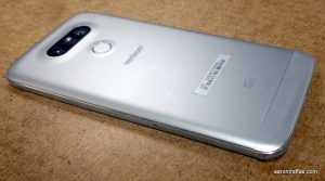
The G5 keeps the wonderful 16 MP rear-facing camera with optical image stabilization and laser autofocus, but it also adds a second, wide-angle camera on the back. It’s tough to describe how powerful this feature is. I found that I use the wide-angle camera about twice as frequently as I use the normal camera.
I found overall battery life to be similar to the other phones I’ve reviewed recently. Like the S7 and PRIV, the battery on the LG G5 lasted me about 8 hours of working and podcasting. There were a few days during harvest when I left the house at 5:30 and was just hoping that the battery would last until I got done servicing the combine so I could get to a charging cable. While it’s nice that the G5 supports quick charging, speed of charge is no substitute for duration of discharge.
The G5 retains the expandable storage option. Other manufacturers have been flirting with removing the optional external SD storage, and I’m glad LG decided to keep that option. As many pictures as Diane is taking with her G5, she’d fill up the internal storage in no time if we didn’t have an SD card in her phone.
The G5 uses the new USB Type-C cable, which means that the old micro-USB cables from older phones won’t work. It’s a great cable, though, as it doesn’t matter which way the cable plugs in to the phone.
The V10 featured a fingerprint reader on the power button, but it didn’t work very well compared to the Samsung readers at the time. The G5 has a fingerprint reader that actually works just as well and as fast as the other fingerprint readers I’ve used.
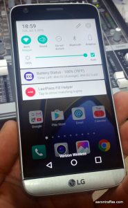
The software design aesthetic on the phone is similar to previous LG phones, with one notable exception. LG has inexplicably removed the app drawer from the launcher – every app is now on the home screen. I’m very meticulous about my home screens, and this arrangement makes me crazy just trying to think about it. Luckily, installing Action Launcher 3 is an easy fix.
LG’s big push on the design overhaul of the G5 has been to facilitate a selection of add-on devices they’re calling friends. Some friends are simple accessories, like the LG 360 CAM that I reviewed yesterday. Some are actual hardware modifications to the phone itself such as the CAM PLUS, which replaces the bottom of the phone with a thicker camera grip and supplemental battery. I understand that LG is trying to encourage third-party development of these add-ons, and I suppose it would be possible for someone to solve most of my complaints about the G5 by making a big battery friend that supports wireless charging, but I don’t have high hopes of that happening.
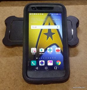
Knowing I’d be using the G5 during harvest, Verizon sent an Otterbox Defender case to keep the phone safe and secure. I was glad to see it didn’t suffer from the same design flaw as the Note5 Otterbox case which raised up so prominently at the top of the screen that it was hard to trigger the notification shade. I had no problems using the G5 in the case.
If it seems like I’m being overly critical of the G5, it’s because I have such an enthusiasm for LG phones and extremely high hopes for all their new releases. As it is, the G5 is still the best phone I’ve seen so far this year – Samsung’s S7 and Note5 still have the annoying physical buttons on the front and neither has a replaceable battery. The PRIV is interesting, but the specs and camera simply aren’t as good as the G5.
The LG G5 takes away some of the features I loved with the G3 and G4, but adds a killer dual camera feature. It’s a great phone for someone who doesn’t need wireless charging and loves taking pictures.
Here’s a gallery of pictures I took with the LG G5. Unedited, except in a couple cases by phone software for sharing to social media.
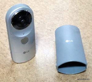
The nascent world of virtual reality is buzzing. It seems every major consumer electronics company is releasing a VR headset like the Samsung Gear VR I reviewed in April. The ability to watch immersive content is great, but being able to create it is even better. That’s why I was excited when my friends at Verizon offered to let me play with the new LG 360 CAM during harvest. It’s a small, tower-shaped device with two 13 MP fish-eye cameras on either side of one of the ends. It takes 360 degree or 180 degree pictures and records video – and it’s a ton of fun.
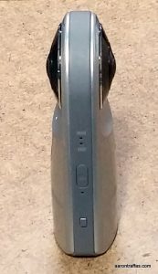
The camera can be triggered by the button or through the LG CAM Manager app. Using the app keeps your arm and fingers out of the shot, and the standard camera mount on the bottom of the device makes it compatible with any number of tripods or camera clamps and clips.
I had the opportunity to play with the LG 360 CAM on the combine, in the backyard and at a couple music concerts. Rather than describe the experience, it’s best to demonstrate. Here’s a sample of some of the photos. If the photo doesn’t work when it loads, click on it to turn on the rotation.
Family wheat harvest
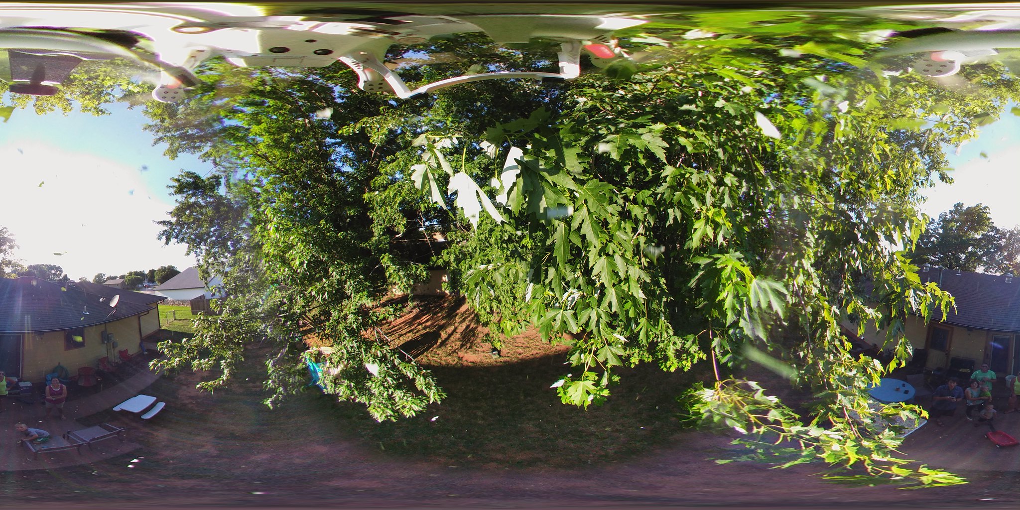
Mounting the camera on a Phantom 3 quadcopter
Testing low light at an acoustic show in Wichita by Ben Nichols from Lucero
The still pictures are tough to share. Not all photo sharing services support displaying them properly. Facebook only seems to work if you upload from the LG 360 CAM Manager app, but once it’s uploaded, Facebook does a good job of displaying the 360 images. Here’s the example image from above shown on Facebook.
Video is similarly easy to take but difficult to share. When I would copy the video file from the camera and then upload it, there was a weird black stitching effect that was introduced. I thought it was a limitation or a problem with the device until I tried to upload directly from the app – it worked great with both YouTube and Facebook. YouTube even enables the Cardboard viewing ability when it recognizes a 360 video, so you can view the videos on your computer screen, phone or Cardboard viewer.
Here is an example of using the LG 360 CAM on my combine during wheat harvest.
Here’s a demonstration of the 360 CAM at a concert. I was skeptical that the microphone would record anything when I sat it on top of the speaker, but it actually did a good job considering the ear-splitting sound levels at the show.
Of course, I can’t test a small, portable camera without strapping it to my drone. Here’s some footage of the LG 360 CAM mounted to my Phantom 3 Professional quadcopter at a backyard barbecue. Don’t forget to look up!
Here’s my YouTube playlist containing several different combine videos I took as well as a video of loading seed wheat into a grain bin.
Since taking 360 video is more a novelty than an industrial application, I didn’t pay much attention to battery life. I can’t imagine an instance where it’ll be used consistently enough during a day where battery life would become an issue – I certainly didn’t have problems recording as much as I wanted after I pulled it off the charger.
The bottom hatch on the LG 360 CAM reveals the SD card slot and USB Type-C port
Note that there is no SD card included, which is a good thing. It keeps the cost of the device low and bundled storage cards are never big enough for me anyway. 360 video creates big files. A nearly 7-minute combine video was nearly a gigabyte, while the still images were between 4 and 6 MB.
The 360 CAM also uses the new USB Type-C cable, which is great because it’s fast and doesn’t matter which way the cable is turned when you plug it in. It’s inconvenient only because it means none of your old cables will work with the 360 CAM.
The difficulty showing off the content is likely only a temporary downside. As more services support 360 images and video, I’m sure it’ll get much easier to share content without being forced to use the app. Facebook and YouTube already support 360 video, and Facebook, Flickr and a few other services support 360 photos, so if using the app on the phone to share isn’t a deal breaker, you’ll have no problem finding a service that supports the content.
Overall, the LG 360 CAM is a really fun device. You can pick it up at your local Verizon store or online for $199.
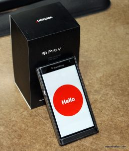
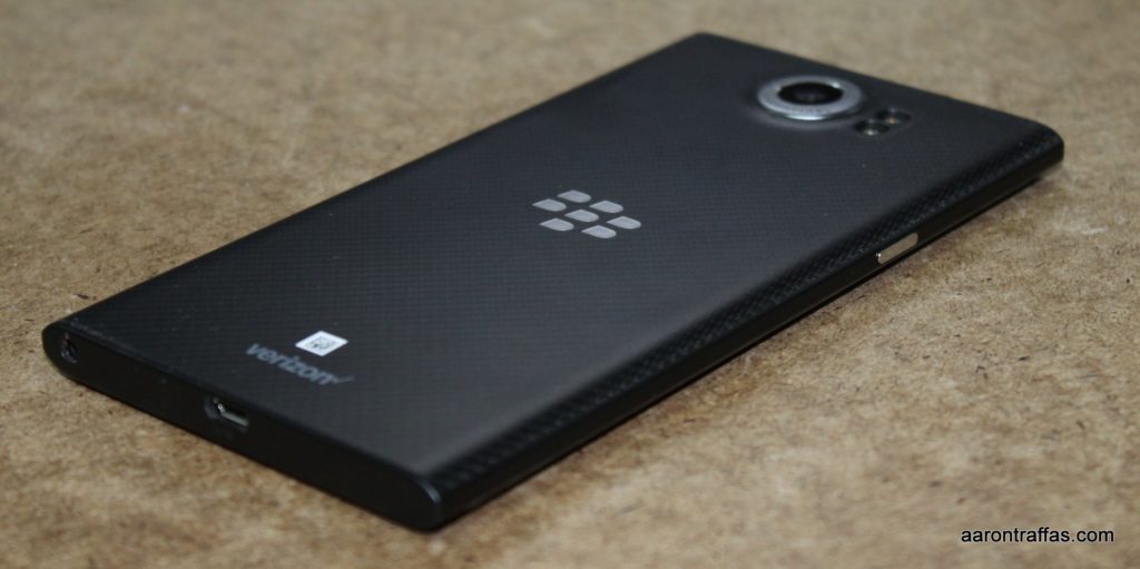
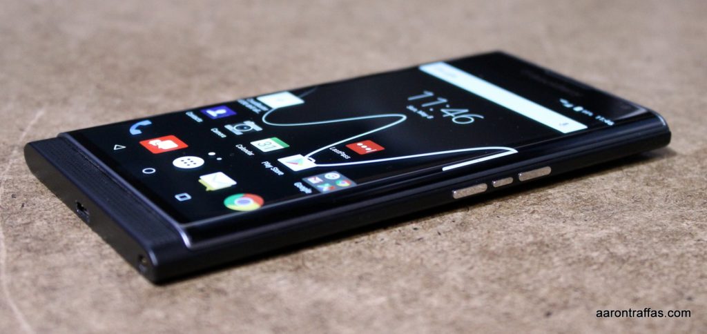
I love the BlackBerry PRIV. It brings innovation to the Android world at a time when most new phones are simply slightly faster and have slightly better cameras than previous years’ models. When Verizon offered to send me the PRIV to review, I couldn’t have been more excited. Here’s what I found.
BlackBerry PRIV
I was an early adopter of the Palm Pre – so early, in fact, that I temporarily left Verizon because Sprint was the exclusive carrier at the time. I quickly came back to Verizon when Verizon released the Motorola Droid and I realized just how bad Sprint’s network was in rural Kansas. I did like WebOS, but more importantly, I loved the portrait slider form factor. A portrait slider is a phone that has a sliding keyboard that slides down when holding the phone vertically, like the Pre, instead of horizontally, like the Droid. We’ve seen a few Android portrait sliders, but they’ve always had mid-range specs that made them unappealing. I always swore that I’d be first to jump on the first flagship phone that had a portrait-sliding keyboard.
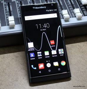
BlackBerry PRIV
BlackBerry’s first phone running Android is the PRIV. It was released last fall and is the first Android phone I’ve seen that has a portrait-sliding keyboard and competitive specs. In addition to keyboards, BlackBerry is known for its security and productivity, so the PRIV has software enhancements aimed at making Android more secure and business easier to conduct.
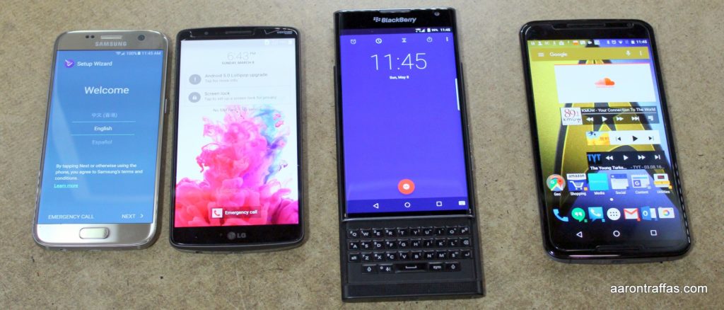
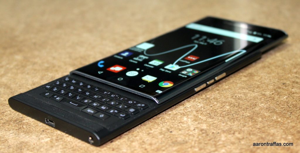
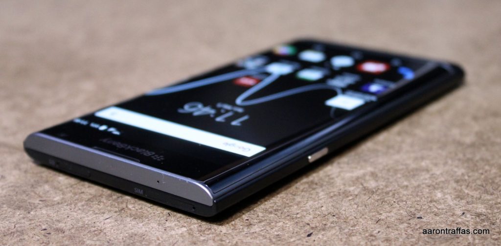
I really like the size of the phone. The 5.4″ screen is big enough to not feel cramped, and the phone gets significantly taller when the keyboard is slid out, making it easier to hold while reading and browsing. The glass on the screen is curved slightly on the edges, similar to the S6 edge+, but as far as I can tell it’s just the glass and not the display itself. It adds elegance to the design without the troubles inherent to the curved display that I mentioned in my S6 edge+ review.
BlackBerry PRIV with keyboard
The keyboard is the most innovative feature of the PRIV. When I’m typing a long message, I can slide it out and compose text without having to worry about accidentally touching the wrong part of the screen. If it’s a short message, I can use an on-screen keyboard for a quick reply. The best part of the keyboard, though, is that it functions like a touchpad for scrolling. Dragging a finger vertically or horizontally across the keyboard will scroll the screen. I don’t really know why, but whether I’m reading RSS feeds or browsing social media, it’s much nicer to scroll with the keyboard out than to have to touch the screen to scroll. Typing on the keyboard from the home screen immediately launches Device Search, which is a global search that finds contacts, apps and app content that matches what you type.
Comparing the size of the Galaxy S7, LG G4, BlackBerry PRIV, Nexus 6
The PRIV is only available with 32GB storage, but that’s not a problem because it offers an SD card slot, allowing me to store all the podcasts and pictures I want without having to worry about filling up the phone.
At 18 MP, the camera is on the larger end. I found that it took beautiful pictures, likely due to the optical image stabilization and large pixel size. It didn’t feel as fast as what I’ve seen on Samsung phones, but it was fast enough to not be a problem. I found the camera app to be the best on any device I’ve seen. I know most smartphones now allow manual control of the camera, but the BlackBerry camera app has a nice slider at the bottom that pops up on launch reminding me to adjust the exposure before taking the picture. I wish I could use it on other phones!
Here are a couple side-by-side comparisons of the camera on the PRIV with the camera on the Samsung Galaxy S7. The PRIV pictures are larger since it’s a larger sensor.
Galaxy S7 left, Blackberry PRIV right
The PRIV and S7 handle colors slightly differently, but not in a bad way.
Galaxy S7 left, Blackberry PRIV right
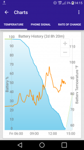
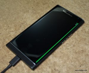
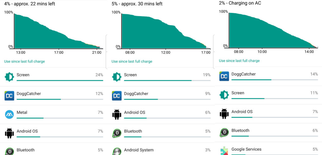
The PRIV’s battery is 3410 mAh, which is larger than most phones released recently. Even though it’s a 13% bigger battery, I found the battery life of the PRIV to be on par with the Galaxy S7. I got between 7 and 10 hours of podcasting use on the farm, as shown in the battery graphs below. I’m guessing that once the PRIV gets the upgrade to the newest version of Android, battery life will get longer. Unfortunately, the sliding keyboard makes me skeptical that a third party will be able to make a battery case that can give the PRIV enough juice to last through the day without charging. Luckily, the PRIV supports both wireless charging and quick charging. Another neat feature is the charging line, which is a colored line that appears on the edge of the screen while it’s off and charging, showing the battery percentage.
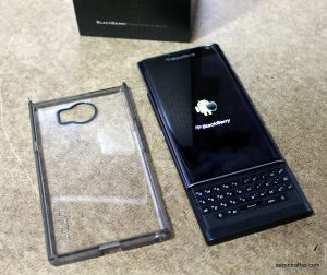
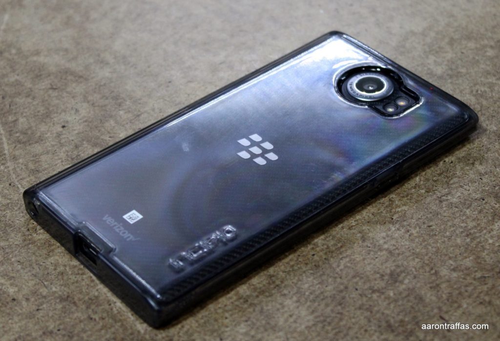
Verizon sent an Incipio Octane Pure case for the PRIV, which snaps on the back. It worked well to protect the back of the phone while not adding any appreciable bulk. If I bought a PRIV, I’d also want a tempered glass screen protector, which I was surprised to find they do indeed make for the PRIV with the curved class on the front.
BlackBerry PRIV with Incipio case
BlackBerry did a great job with the software on the PRIV. The notification shade is nearly stock Android, and the launcher is also clean and reminiscent of the stock Google launcher found on the Nexus 6. There’s an overlay that’s always available by swiping from the side that allows quick access to calendar, messages, tasks and contacts. They’ve included custom apps, but they’re optional and stay out of the way if you don’t want to use them.
BlackBerry included Password Keeper, DTEK, BBM, Hub, Device Search and Notes. Password Keeper does what it says, though I’d recommend Lastpass. DTEK monitors the apps and security settings on the device to show any problems with a quick glance. BBM, BlackBerry Messenger, is BlackBerry’s bread-and-butter messaging service that should be familiar to anyone whose ever owned a BlackBerry from the past. Hub, also familiar to previous BlackBerry users, is a central location to manage multiple email and social media accounts simultaneously. I already mentioned Device Search, and Notes looks like a simple notes app that can sync with Microsoft Exchange.
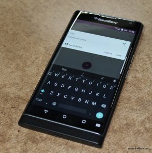
You can use an on-screen keyboard with the BlackBerry PRIV
If I could change anything about the BlackBerry PRIV, I’d give it an upgradable battery and make it just a little bit faster. Speed wasn’t a problem during daily use, but there were a couple of times when I pushed it hard enough to notice it lagging a little bit.
In summary, I love the BlackBerry PRIV. The touchpad functionality of the keyboard makes it the perfect device for reading and consuming content, and the keyboard itself is a welcome alternative to the limitations of the traditional on-screen keyboards. BlackBerry fans will like the productivity apps, and anyone who is security-conscious will appreciate the enhancements BlackBerry’s made to make Android more secure. When I finish farming and put my LG G3 away for the winter, I’m going to have to take a hard look at the BlackBerry PRIV.
Here’s a gallery of photos I took while reviewing the PRIV. As always, they’re unedited.
The Kansas capital buildingPlanting soybeansThe best place for a clay target throwerBlack Hawk helicopter loading water to fight firesBlack Hawk helicopter loading water to fight firesNolan on the rocksBlack Hawk helicopter loading water to fight firesBlack Hawk helicopter loading water to fight firesEaster huntEaster huntMaking a mess, it’s CallanFlowers
I was not compensated for this review. All opinions are my own.
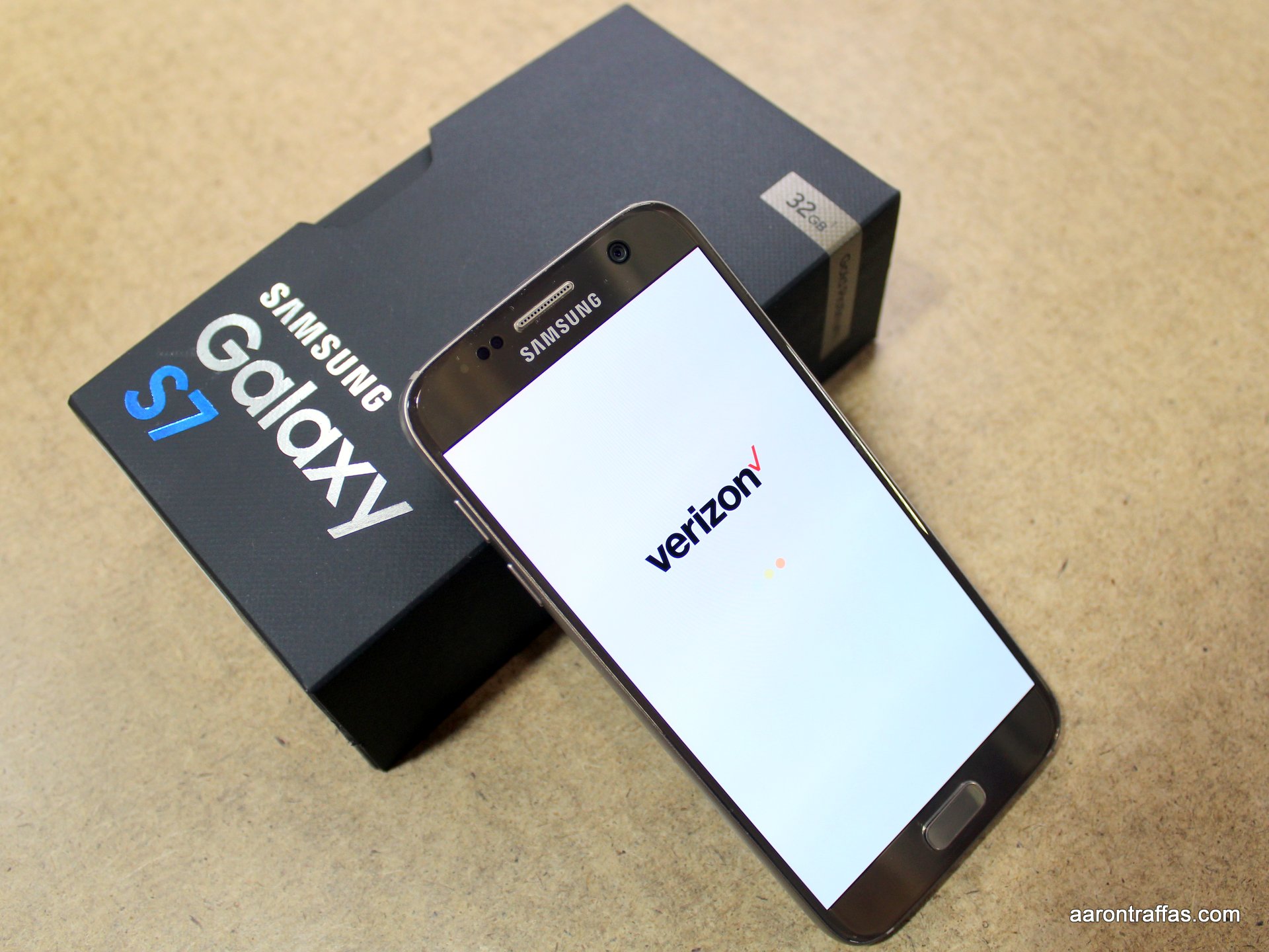
I feel like I’ve been on a Samsung binge recently. So far this year, I’ve reviewed the Galaxy S6 edge+ and the Galaxy Note5. Verizon recently offered to let me take an extended look at the new Galaxy S7 and they even threw in a Gear VR, the review for which I posted earlier this week.
Galaxy S7
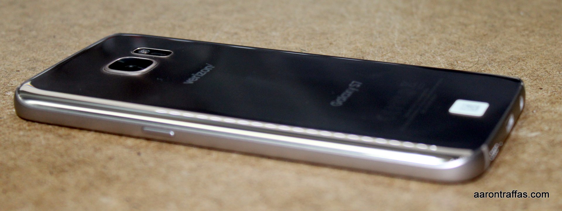
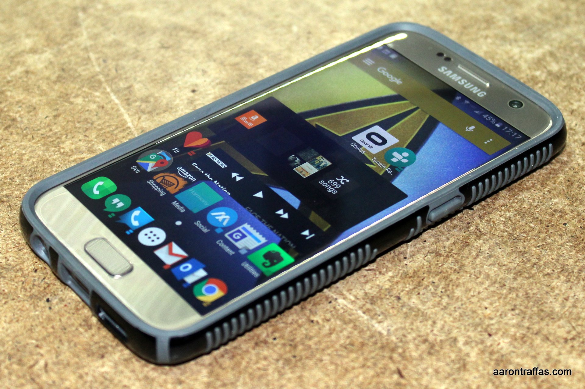
The S7 is very similar in design to the Galaxy S6. They’re essentially the same size, though the S7 is thicker to support a bigger battery. That thickness makes the protrusion on the back for the camera much less pronounced. The back is still unfortunately glass, but the edges are rounded in a way that makes it feel less slick than the S6 – the S7 feels like the premium phone that it is.
The S7 has the same top-of-the-line performance, beautiful screen and shockingly fast camera that you’d expect from Samsung’s latest flagship. It’s water- and dust-resistant, but that’s not exactly a feature I wanted to test. The S7 features the same fast and accurate fingerprint sensor found on the S6 – so accurate, in fact, that I used it for a couple weeks before even peeling the plastic sticker off of the home button.
The biggest improvement of the S7 over the S6 is the SD card slot. The 32 GB on the phone simply isn’t enough for my podcasts, and the expandable storage means I don’t have to write mean things about it being a missing feature like I did with the S6! Samsung is also unfortunately still using a physical home button with capacitive back and recent apps buttons that are reversed from standard Android configurations.
Another new feature is the always-on screen. The phone always shows the date, time and battery charge, even when it’s turned off.
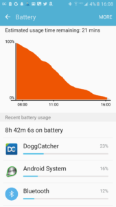
Example podcast battery curve
I’m still disappointed that the battery in recent Galaxy phones is no longer upgradable. The battery on the S7 is 3000 mAh compared to the 2550 mAh on the S6, but it’s still not enough to make it through the day. In fairness, the performance is much better than the S6, but I want a phone that I can pull off the charger at 6 a.m. and play podcasts until I come in from the field at 10 p.m. Here’s a battery curve for the S7 showing that it lasted from 7:30 a.m. to 4 p.m. in my real-world podcast test. It’s a problem that could be solved with a third-party battery case, but an external battery cases doesn’t work as well as a single, larger battery.
Samsung partially makes up for the lack of an expandable battery by making it easy to charge the S7. It supports fast charging as well as wireless charging, which means the only reason to plug the phone in is when you’re in a hurry or to transfer pictures.
Speaking of pictures, the camera on the S7 is pretty stellar. It has fewer, larger pixels than Samsung’s previous cameras, which means better low-light performance. As usual, I’ll include a gallery at the end of this review, but here are side-by-side comparisons of the Galaxy S7 (left) and the Blackberry PRIV (right). The PRIV has more pixels, so the images look bigger. These are thumbnails, but the originals are on the attachment pages if you click on the images to see the comparisons in detail. As you can see, the color response on the S7 seems much more realistic.
Galaxy S7 left, Blackberry PRIV right
This second side-by-side shows how much more vibrant the colors are on the S7 than the PRIV.
Galaxy S7 left, Blackberry PRIV right
The video camera has fun shooting modes as well. Here’s an example of the slow motion video capture.
Samsung’s software is still a little frustrating, but less so than on previous Galaxy smartphones. It still warns me about listening at high volume whenever I turn my headphones up loud enough to hear them, which is frustrating. It also displays a notification on each reboot telling me I have an SD card installed. The launcher and keyboard are less obnoxious than previous Galaxy iterations, but not good enough to prevent installing Action Launcher 3 and the Google Keyboard.
The S7 with the CandyShell Grip case
The S7 isn’t as thin and hard to hold as the S6, but it’s still not something that would be easy to use without a case. Verizon sent me a speck CandyShell Grip case with the S7. It’s a great addition that makes it much easier to hold and use. Since that case didn’t have a belt clip, I grabbed a Bentoben case with belt clip from Amazon. While it was a cheap way to get a belt clip for the S7, it’s a very bad design because the soft shell is simply way too soft.
Top three reasons to buy the Samsung Galaxy S7
The Samsung Galaxy S7
It’s a fast phone with an amazing camera
Premium build quality
Features – water resistance, fast charging, fingerprint reader
Top three reasons to pass on the Samsung Galaxy S7
Physical, backwards buttons on the front
Non-upgradable battery
Not large enough
Granted, these are personal preferences. I happen to like big phones without buttons on the front. However, I’ve also told multiple people that this is the first Samsung phone I’ve actually thought about buying for myself in years because it’s just that good.
The Samsung Galaxy S7 is currently $672 from Verizon, which is running a limited time, buy-one-get-one-free offer.
Here’s the photo gallery. As always, they’re unedited.
Anderson Creek fire just miles awayThanksgivingNolan helping his brother Callan at the Easter egg huntNolan boxing out his cousin at the Easter egg huntBlack Hawk hauling water to fight Anderson Creek fireNolan on the rocksAnother fire in the distanceSwingingLow light performanceCanolaFabricatingCallan drivesPond in pastureFungicide rig got stuck2×2 fertilizer deliveryMaking Erica jealousBubbles for Callan!
It was just over a year ago that I bought a Google Cardboard. It’s a simple virtual reality headset that’s literally made of cardboard. It has a couple lenses and a magnet, and allows you to view your phone as if it were a pair of goggles. Unfortunately, my version wasn’t the highest quality and has since broken. It was also a little too simple – the only control was looking at a specific place and sliding the magnet as a rudimentary selector.
Samsung Gear VR
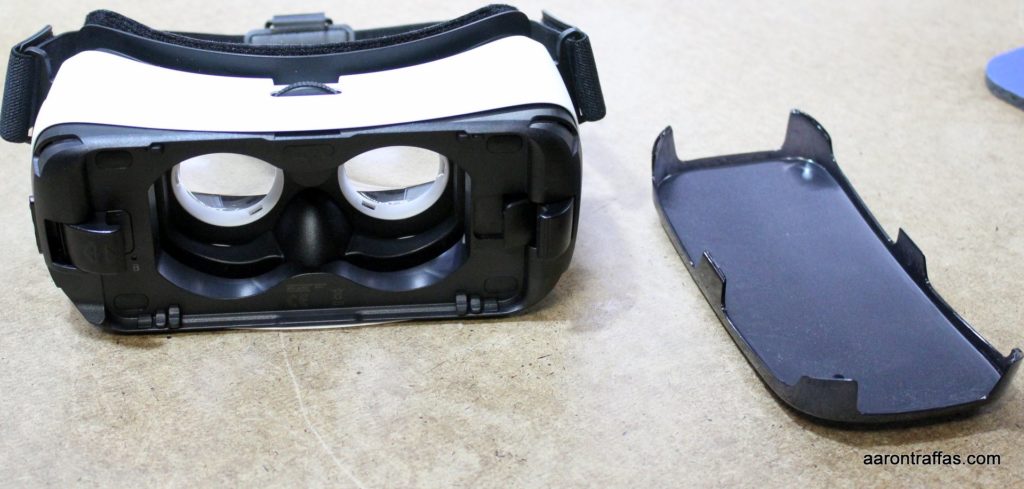
My friends at Verizon recently let me play with Samsung’s Gear VR along with a Samsung Galaxy S7. The Gear VR operates on roughly the same concept as Cardboard – you put your phone in the goggles and it serves as the actual display – but has a much higher build quality. In addition to better hardware quality, the Gear VR includes its own app store as well as an actual touchpad.
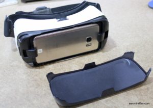
The Galaxy S7 in the Gear VR
The touchpad can work because, unlike Cardboard which just clamps any phone in the holder, the Gear VR has a plug that actually connects to the jack on supported Samsung phones. The phone is mounted in such a way that the headphone jack is accessible, and headphones are recommended for a completely immersive experience.
There are myriad free and commercial apps in the Oculus Store. Most offerings are games or short 3D movies that demonstrate the VR experience. There’s a Netflix client and even a web browser. The store itself is built to be accessed from the headset, and navigation is simple and intuitive after a short walkthrough showing how to use the touchpad.
Screenshot from the 2016 Masters
I found the most enjoyment in the VR streams, including a live stream of the 2016 Masters. I was able to tune in and select the hole I wanted to stand on to watch the tournament in real time. While watching golf isn’t really my thing, I was really impressed with the quality of the experience.
I also watched some basketball highlights from the recent 2016 basketball season. The ability to look wherever I want without being restricted to what the camera angle is showing is a really neat experience.
Screenshot from watching a basketball game with the Gear VR
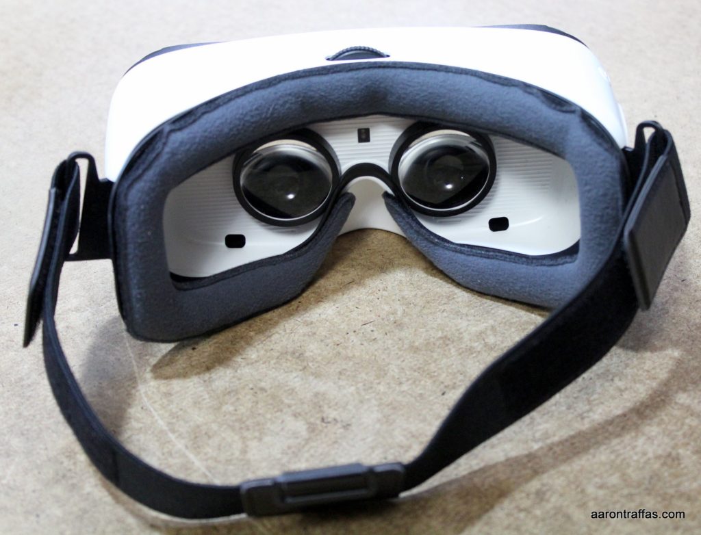
The only problem I had with the usability of the Gear VR was that the strap wasn’t quite big enough for my enormous head. Because it was so tight, even after adjusting the strap to the loosest setting, it pulled the headset so close that my eyelashes kept pushing against the lenses. This inconvenience won’t be a problem for the vast majority of users, and, if I didn’t have to send the device back, I’m sure I could make some modifications that would let me use it comfortably.
The Samsung Gear VR is a great choice for anyone with a compatible Samsung phone who wants to experience VR on a headset that’s easier and more natural to navigate than Cardboard with an app and content ecosystem that, while proprietary, feels much more fleshed out.
I’m an Android Wear enthusiast. I had a Samsung Gear Live for a while before I fell in love with my Asus ZenWatch, but I’m always interested in seeing different approaches by different manufacturers. Verizon let me play with an LG Watch Urbane last fall, and they recently let me try the Moto 360 Sport while I was reviewing the Galaxy Note 5.
Moto 360 Sport
As much LG geared the Watch Urbane to be an elegant fashion statement, Motorola has taken their 360 line of smartwatches and focused the 360 Sport on fitness tracking. Its band is a silicone strap that’s not replaceable. It has a GPS so you could track a run without having to take a phone along.
The display is what Motorola calls AnyLight and is readable indoors and in sunlight. It’s much easier to see than other watches I’ve tried. While I still think Android Wear works better on square devices, I didn’t feel like the round screen was as much of a problem as it was on the LG Watch Urbane. The screen of the 360 Sport isn’t entirely round – there’s a notch at the bottom for a light sensor.
Like most Android Wear watches, the 360 Sport has Wi-Fi so the watch can display updates when not connected to a phone by Bluetooth. Google Play Music supports syncing music to the watch, and the watch can pair with a Bluetooth headset, so leaving a phone behind for a run is actually possible without sacrificing GPS or listening to music. I never tried because Doggcatcher doesn’t support syncing podcasts to Android Wear yet.
Moto Body plots heart rate, pace and calories over time
I found battery life to be good, lasting a full day and part of the next day when I would forget to put it on the charger. Unlike most smartwatches, the Moto 360 Sport has a wireless charger. It’s so much more convenient to set the watch on the charger at night rather than trying to line up the pins on a clip-on cradle like the Gear Live or ZenWatch.
While Runkeeper isn’t able to use the Moto 360 Sport to track heart rate, I found the Moto Body app to be a great substitute. In addition to mapping the run and tracking time and pace, it plots heart rate, pace and calorie utilization over time. If the Moto Body app would work with my ZenWatch, I’d probably start using it regularly.
The newest version of Android Wear that was released while I was reviewing this watch introduces additional gestures that allow navigating the menus and interacting with notifications with wrist movements.
The microphone on my ZenWatch has been broken for many months, so it was great to be able to talk to a watch again. Android’s voice interactions continue to get better, and it’s great to set timers and reminders without having to reach for the phone.
All in all, the Moto 360 looks and feels like a fitness tracker, but has all the power of Android Wear. The Moto Body app works really well and integrates nicely with the watch. The GPS and AnyLight display make this watch more functional than most watches on the market, and the wireless charging make it one of the most convenient to use. If you’re looking at Android Wear because you want a great fitness tracker, it’d be tough to select anything other than the Moto 360 Sport.
It’s no secret that I’ve been lukewarm on Samsung devices for the last few years. My Samsung Galaxy Nexus was one of the best devices I’ve ever owned. When it finally died, I moved up to the Samsung Galaxy Note 3 which had awful antenna design problems and TouchWiz, which soured me on Samsung for a couple years. Since then, I’ve reviewed the Galaxy S6 and Galaxy S6 edge+. The S6 was too small for me, while the S6 edge plus had the curved screen that was much more attractive than functional for me. My friends at Verizon offered to let me play with the Galaxy Note5, and I was excited to find out how I’d like the big, flat phone from Samsung.
Samsung Galaxy Note5 with S Pen
The phone feels like a premium device in my hand. It’s easier to hold than the S6 or S6 edge+, even with the unfortunately glass back. The signature feature of the Note line from Samsung is the stylus, and the Note5’s S-pen makes it easy to take handwritten notes or select and manipulate screenshots.
The display is gorgeous. The 5.7″ display is smaller than my Nexus 6 but bigger than my LG G3. It feels just right to me, and Samsung has solved the biggest problem I have with OLED displays – the red tint. I’ve always preferred IPS displays because whites seem whiter. The OLED display on the Nexus 6 seems red. Amazingly, the Note5 seems even whiter than the IPS display on my LG G3. All three phones were set to full brightness for this photo.
Comparing the displays of the Nexus 6, Note5 and LG G3
Samsung still puts TouchWiz on top of Android. It’s still frustrating, but installing the Google Keyboard and Action Launcher 3 makes using a Samsung phone seem much less suffocating than it did back in the Note 3 days. There is a ridiculous amount of pre-installed apps that can be disabled but not removed. While I was reviewing the Note5, Verizon pushed out the Android 6 update, which enabled Google Now on Tap and better battery management. The notification shade feels much cleaner now as well.
Not much of a camera bulge like the S6
Samsung is known for its fast cameras, and the cameras on the Note5 is no slouch. From what I can tell, the 16 MP main camera and 5 MP front camera are the same as those on the Galaxy S6 and S6 edge+. The camera is very quick to launch, especially using the double-press shortcut of the home button, and the myriad shooting modes are easy to understand and use. As usual, I’ll have an unedited gallery at the end of this post showing real-world example pictures I took with the phone. Here’s a short video example from a round of golf showing my brother-in-law with a difficult shot.
Speaking of the home button, the Note5 has one. That’s a big deal-breaker for me – I’ll never know why Samsung went back to physical buttons after the Galaxy Nexus didn’t have them, but they’re one of the only manufacturers still clinging to that poor design decision. However, if you’re going to pollute the front of a phone with a button, you might as well build an amazing fingerprint reader into it. I’ve only used a couple of phones with finterprint readers, but Samsung’s readers are fast and consistent.
There’s no expandable storage on the Note5 and the 3000 mAh battery isn’t upgradable. My review unit was 32 GB, which simply isn’t big enough for me. I’m running about 400 episodes behind on my podcasts, so Doggcatcher‘s using over 15 GB. The phone reserves 8.5 GB as system memory and my apps use nearly 7 GB, which doesn’t leave much space for pictures and video. If you’re buying a phone without expandable storage, always opt for at least 64 GB.
It’s 2016, and we shouldn’t have to plug our phones in like animals to charge them. The Note5 features two different wireless charging standards, so it’s completely compatible with all my existing wireless charging stations around my house. It also supports fast charging, so when I was in a hurry, I could get enough power in it to finish the day.
The Otterbox Defender case interferes with accessing the notification shade.
I’m pretty active with my phones, so I always use a case with a belt clip. Verizon sent me an Otterbox Defender to use with this Note5 and I have to say it’s not the case for me. It’s plenty rugged and durable, but there is one small design flaw that makes using the phone with this case quite irritating. As you can see in the picture, the case at the top of the phone protrudes up at a sharp angle immediately superior to the upper edge of the screen. Triggering the notification shade actually requires effort, since it’s actually difficult to touch the very top of the screen.
The Note5 performed great for me. It’s very snappy and responsive. Bluetooth worked great with the Moto360 smartwatch that Verizon also sent – I’ll be posting a review of it tomorrow. I did notice some issues with play and pause sometimes not working with my LG Tone headset, but I’m not sure if that was a problem with the phone or if it was a configuration issue with Doggcatcher and the lock screen.
In summary, when I send the phone back to Verizon tomorrow, I’m going to miss a few things. I won’t miss the physical buttons or TouchWiz, nor all the pre-installed apps. I am, however, going to miss the fast camera and fingerprint reader. I’ll miss the gorgeous display and snappy performance. If I were to own a Samsung phone and had to choose among the S6, S6 edge+ and Note5, I would definitely get the Note5 – but I’d get the 64 GB model.
Photo gallery As always, for pictures taken with the phone, I’ve done no editing. The pictures are as they were when they came off the camera. You can view the full version by downloading it from the attachment page.
Verizon’s Note5
Samsung Galaxy Note5
Ottorbox Defender case
Bradford pear
Bradford pear
The Kansas caucus
The Kansas caucus
The Kansas caucus
Dancing baby
I always wanted to know what was in golf irrigation trench
You must be logged in to post a comment.